What to Expect When Sourcing Plastic Molds from China
Jul 17, 2026
Small electronic accessories often share a familiar problem: their purpose is clear, but using them can still feel awkward.
A smooth case may look clean while offering little purchase for the fingers. Extra lines may add visual detail while making the object feel busy on a desk. A glossy finish may suggest technology, yet its reflections can overwhelm the shape.

This design therefore starts with everyday handling.
The aim is to make the case easy to understand at a glance, comfortable to pick up, and pleasant enough to leave within sight.
Rounded Design Is About More Than Soft Edges
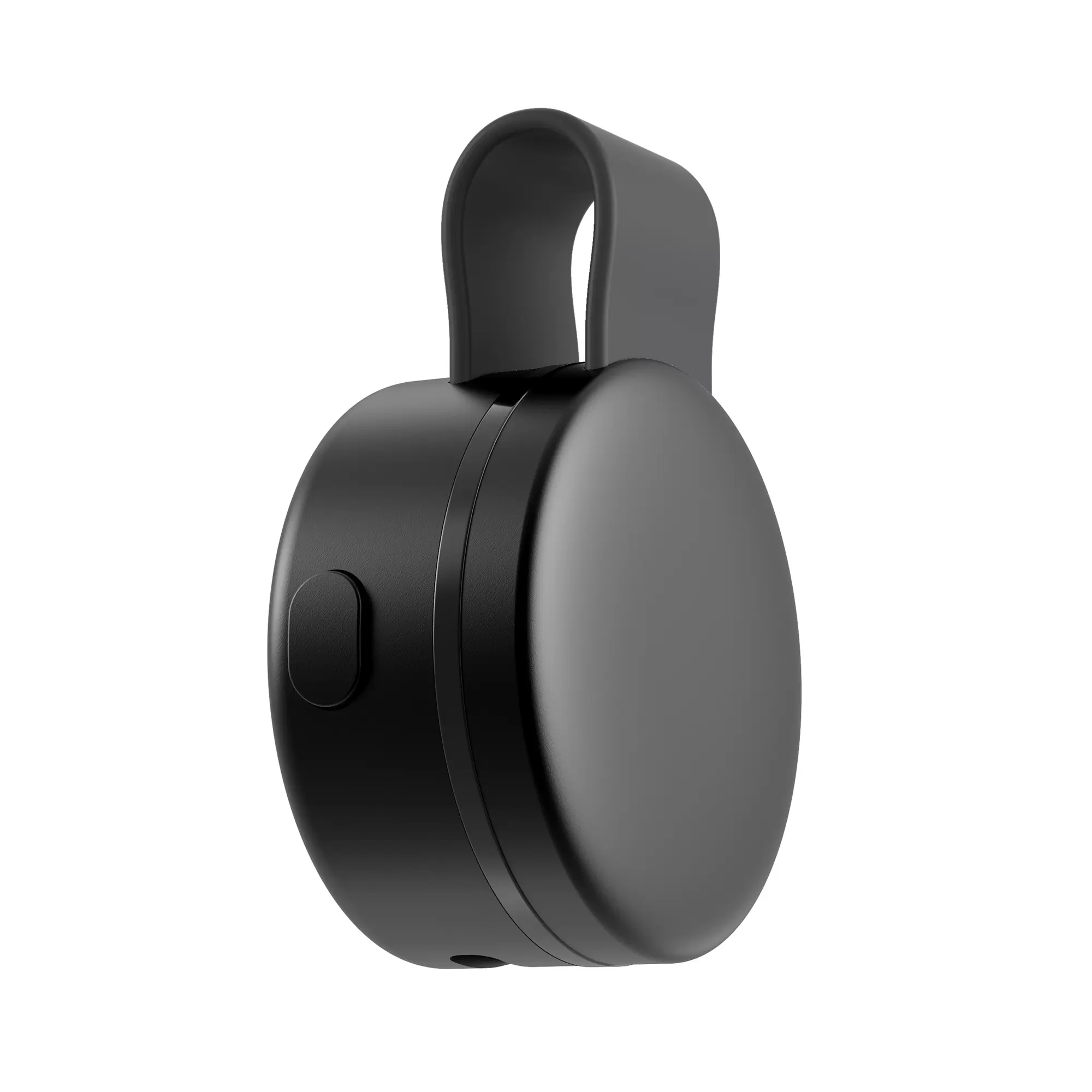
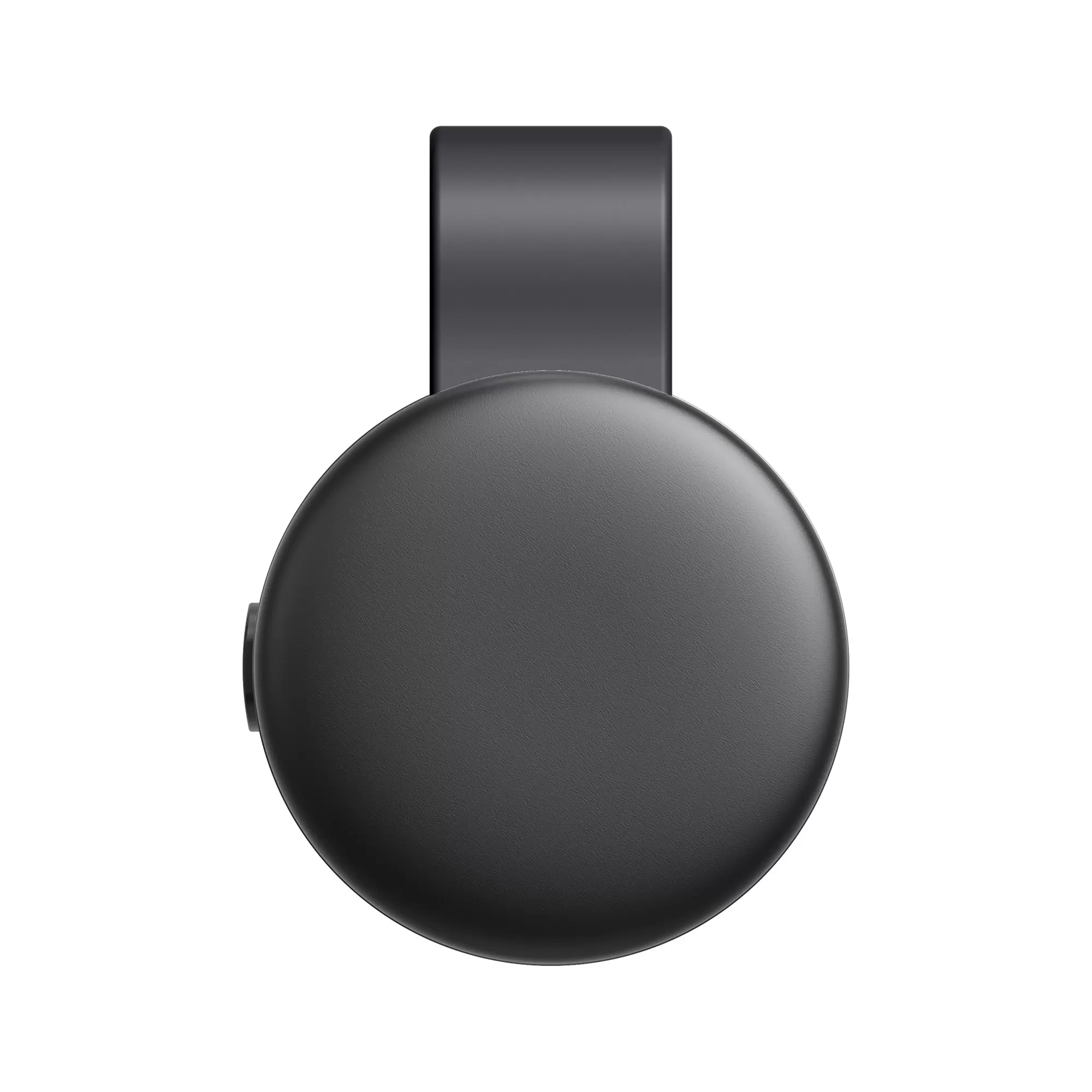
The concept uses a near-circular silhouette with a gently raised front surface. Its edges transition gradually into the sidewall.
That subtle change affects how substantial the product appears.
A flat face and straight sides can make a case look like a basic shell. Too much curvature can make it feel bulky. Here, the gently raised face gives the body a sense of fullness, while the softened perimeter keeps the outline approachable.
The seam around the body also contributes to the appearance. It makes the relationship between the lid and main housing easier to read without fragmenting the surface.
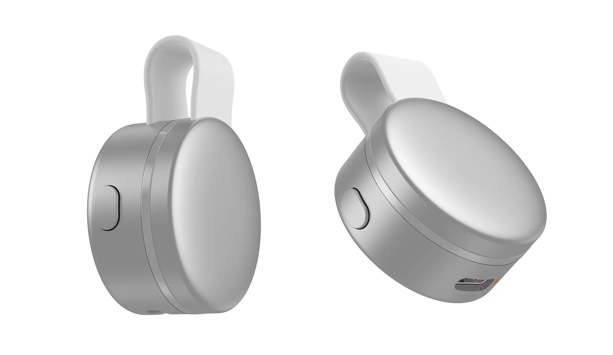
During further development, the consistency of that gap and the alignment of adjoining surfaces will have a direct effect on the physical product’s perceived quality.
Surface Character Does Not Require Strong Reflections
The silver-white version suggests a fine metallic texture. The black version feels quieter and more restrained. The interesting difference is not simply the color, but how light moves across each surface.
Broad highlights can make a small product eye-catching. Harsh or uneven reflections, however, can draw attention to abrupt changes in curvature.
In the concept image, softer reflections help the front remain visually continuous while gradually revealing the curved sides. The silhouette reads from a distance; finer texture becomes apparent at closer range.
That progression gives the design depth without relying on additional decoration.
The actual materials and finishing processes still require sample evaluation. The rendered appearance provides a direction for that development.
The Strap and Side Details Should Support Real Actions
The loop strap above the body gives the fingers an obvious place to lift the case. It also introduces a recognizable feature to an otherwise simple rounded form.
A button-like side element and a lower connector opening follow the body’s contour, preserving the uninterrupted front surface. Their further development should consider the intended interaction, clearance for connecting a cable, and the arrangement of internal components.
Users may rarely describe these details individually. They will still encounter them whenever they pick up, connect, or put away the case.
Much of an accessory’s usability lives in these small moments.
For the wearer, the intended value is straightforward: a place for the ring after removal, an easier way to handle its charging accessory, and a more orderly collection of everyday belongings.
A thoughtful accessory does not need to keep drawing attention to its details. It can sit comfortably on a desk, travel naturally with its owner, and feel intuitive whenever it is needed.